
(1) It's a challenge just coming up with a unique idea that effectively visualizes the words and adds another layer of story telling. (2) A pretty picture is one thing but being able to clearly communicate storytelling with pictures so the viewer (especially young viewers) understands is tricky. (3) Being able to faithfully translate the idea in your head onto a piece of paper is no piece of cake. (4) Convincing others your idea is good, such as your editor, art director, writer, and sales department (in the case of cover illustrations) is probably the least appreciated but one of the most daunting. (5) Simply being able to finish the artwork to the level you desire in the limited time you have. And (6) The printed book art actually looking like the original art.
These are not the only challenges but you get the sense of some of hoops it takes to complete an illustration, and it adds another layer of appreciation when I see an amazing illustration in print - not only is it a wonderful image but the creators were able to navigate all the pitfalls to actually make it happen.

Comparing the above sketch and finished art for places to be muddy here are some things to note.
(1) The guy in the yellow boots sports a nifty bicycle hat in the finished art but not the sketch, perhaps it was a late inspiration or someone else's suggestion.
(2) If you are familiar with Renata's work she doesn't normally put clothing on her animals, only when they serve a specific purpose. In this case the rubber boots help define the setting and characters roles, as well as enrich the sentiment of the storytelling.

Comparing the above sketch and finished art for places to be careful here are some things to note.
(1) How change can make old ideas new. In a classic hollywood movie the distraction would have been a book, but now it's cellphones – which makes this slapstick concept relevant again.
(2) I was worried that the level of slapstick was going to be a bit too much drama for a picture book, but maybe adding the safety cone into the final art made it acceptable? (also no orange bicycle hat here either)
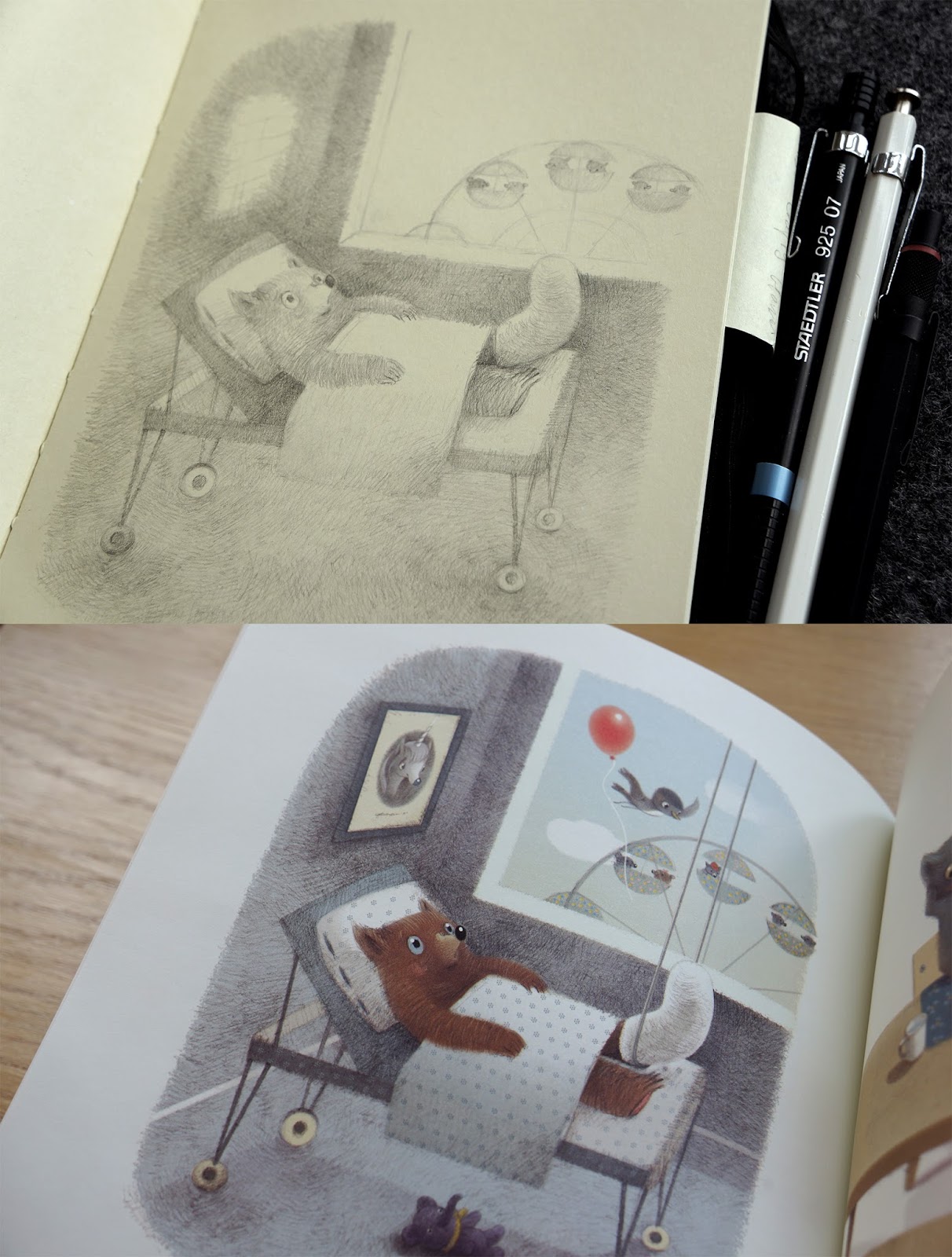
Comparing the above sketch and finished art for places to be bored here are some things to note.
(1) The other main character has been added to the finished art, seated by himself in the ferris wheel. Continuing the buddy dynamic as well as adding another subtle layer of story – without his friend to enjoy the ride with, is he bored too? Renata often adds these extra elements intuitively as she finishes the art.
(2) There are several other background elements not in the drawing which were added later. The framed unicorn picture was added at my request. I've been working on writing a unicorn story and thought it would be neat to have Renata draw a fantasy character which might one day have it's own book ... maybe.