Thursday, June 29, 2017

Tape-ography


In January we were excited to get our new studio at cSPACE King Edward, an old sandstone school built in 1912, which has/is being converted into an arts incubator in south Calgary.


Our studio is half of a classroom which was the principal's office in the 70's and so we are calling it the "Principles Office". Some of the original mouldings were kept but essentially it's a blank canvas.


I started with a photoshop mashup to plan and visualize how we would set up the space. I controlled costs by using off the shelf shelving and customizing them with hard wood tops and such.


I wanted to enclose the sink so it would be less of a focal point and would have a cleaner profile when we have gallery shows. It was a challenge to visualize and find a way to make this happen.


I painted a feature wall grey which went well with dark brown moulding. I was really keen on the idea of a mural but I didn't want to commit to a hand painted mural or the expense of digital vinyl.


The tape drawings were pretty spontaneous. For example originally I wanted to do a big head shape. I did quick sketches in my sketchbook and then guesstimated it's placement on the wall.


Sometimes this didn't work out and I "erased" the original designs. For this design I wanted something more whimsical and something that would utilize the wall space better.


It usually took me a day or two to do each design element.  The tools I used were ladders, levels, scissors, rulers, and photography tape. I had to redo a character because it didn't read as a brain.


I originally saw tape murals done at an illustration conference, Icon 7. You can do much more organic line if you plan and cut your tape, but it was much quicker and easier to use geometric line.


The "SHARE" design was an illustration I did years ago and reused here. Art's Gym was a name considered for the studio but it was already used. I plan to use this straight lined style in other illos.


I enjoyed working with wood, and real wood was surprisingly economical. But I also used veneer plywood because of the ease, and I also like how it looks when lamented –  like around the sink.


I also did a bunch of furniture hacking including these shelves which I added table tops, wheels and wood doors. I had some old beat up benches that I painted and added a top to match.


I put wheels on everything so the studio can be modular and multifunctional. A space where we can do work, put on shows, workshops, or collaborative projects.

Many people that come in to the studio are curious what tape I use, some assume electrical tape which would be hell to work with. I use old school photo tape and it cost under 100 bucks total.


This is how it looks as of today. Now that the studio is mostly organized we are now focusing on organizing ourselves(!) and our mission plan as an incubator for all things illustrative. The tape mural will be up until late August. After which we will need the wall space for some exciting group shows and collaborative projects in the fall!


Tuesday, May 16, 2017

Places to Start and Places to Finish

For Renata it all starts in her sketchbook, and ends on the computer. The creative process of making an illustration can probably seem pretty straight forward, your inspired, you draw it, color it, and then it's printed for others to enjoy.  But more often than not each step has it's challenges which sometimes can be overwhelming.

(1) It's a challenge just coming up with a unique idea that effectively visualizes the words and adds another layer of story telling.  (2) A pretty picture is one thing but being able to clearly communicate storytelling with pictures so the viewer (especially young viewers) understands is tricky. (3) Being able to faithfully translate the idea in your head onto a piece of paper is no piece of cake. (4) Convincing others your idea is good, such as your editor, art director, writer, and sales department (in the case of cover illustrations) is probably the least appreciated but one of the most daunting. (5) Simply being able to finish the artwork to the level you desire in the limited time you have. And (6) The printed book art actually looking like the original art.

These are not the only challenges but you get the sense of some of hoops it takes to complete an illustration, and it adds another layer of appreciation when I see an amazing illustration in print - not only is it a wonderful image but the creators were able to navigate all the pitfalls to actually make it happen.


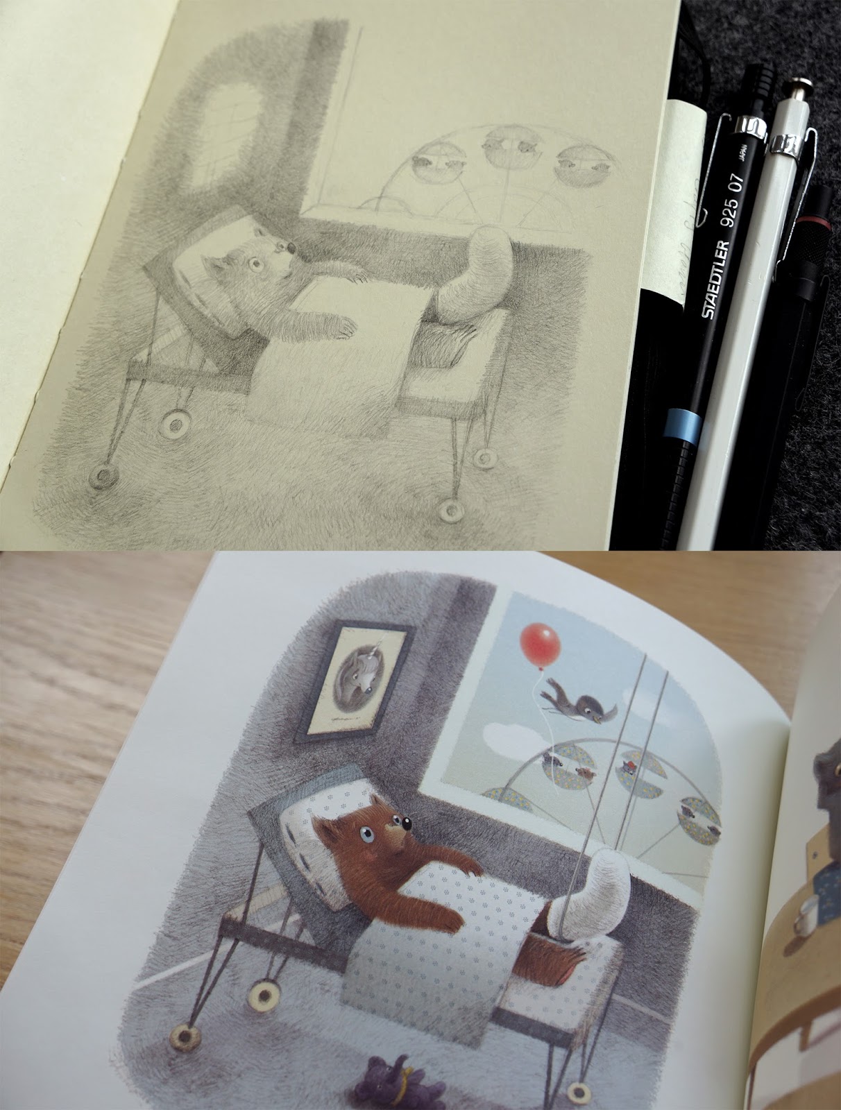
Comparing the above sketch and finished art for places to be muddy here are some things to note.

(1) The guy in the yellow boots sports a nifty bicycle hat in the finished art but not the sketch, perhaps it was a late inspiration or someone else's suggestion.

(2) If you are familiar with Renata's work she doesn't normally put clothing on her animals, only when they serve a specific purpose. In this case the rubber boots help define the setting and characters roles, as well as enrich the sentiment of the storytelling.


Comparing the above sketch and finished art for places to be careful here are some things to note.

(1) How change can make old ideas new. In a classic hollywood movie the distraction would have been a book, but now it's cellphones – which makes this slapstick concept relevant again.

(2) I was worried that the level of slapstick was going to be a bit too much drama for a picture book, but maybe adding the safety cone into the final art made it acceptable? (also no orange bicycle hat here either)


Comparing the above sketch and finished art for places to be bored here are some things to note.

(1) The other main character has been added to the finished art, seated by himself in the ferris wheel. Continuing the buddy dynamic as well as adding another subtle layer of story – without his friend to enjoy the ride with, is he bored too? Renata often adds these extra elements intuitively as she finishes the art.

(2) There are several other background elements not in the drawing which were added later. The framed unicorn picture was added at my request. I've been working on writing a unicorn story and thought it would be neat to have Renata draw a fantasy character which might one day have it's own book ... maybe.


Sunday, April 23, 2017

Places To Be Creative

We have a lot to celebrate in the coming months, Renata has several new books including the brand new Places To Be, an exciting collaboration with writer Mack Barnett! We've also been lucky to have the opportunity to be included in a new creative incubator called cSPACE King Edward. It is a historical sandstone school house built in 1912 that has been painstakingly rejuvenated to be a home to artists and cultural organizations. In May I am hoping to combine these creative endeavours with an exhibition and open house at the studio in this wonderful building. We've named our studio The Principles Office inspired by the fact that it was the Principals Office starting around the 1950's. I am hoping The Principles Office will truly be a place to be creative, for ourselves and others. Our goal is it will be a place to celebrate and collaborate creativity in illustration, design and the like.


Sunday, January 29, 2017

Dreaming

Renata was very excited to see a post from Marsha Diane Arnold talking about their shared book Waiting for Snow on Seven Impossible Things Before Breakfast. She is a big fan of the blog so it was a special treat. In it Marsha mentions that Renata had asked her to change the animal species of one of the characters, the Dormouse. It is interesting to read the emotional adjustment that Marsha had to make, which Renata super appreciated. (plus the replacement character turned out to be one of Renata's new favourite characters!)


Further to that, I thought it would be fun to discuss why Renata asked for the casting change? And it's an excellent segue to introducing Renata's next book, Dormouse Dreams written by Karma Wilson. By the title you can perhaps see Renata was worried about having the same character in two unrelated books in a row. In truth, Renata's characters are like her own little shakespearean acting troupe with the same cast of rogues appearing in different roles for each of her books. But because Dormouse, actually Dormice, are the stars of this newest book she was worried about overlap.


Interestingly this is not the only parallel between the books. Waiting for Snow's central theme is patience, and everyone involved in this project had to show a little patience in it's development process. Dormouse was actually started before Waiting for Snow. This delay worked out in one way because the two books also have a seasonal parallel. Waiting for Snow involves waiting for snow and the anticipation of the winter season. While Dormouse has a background narrative, that literally, is the transition from winter to spring, and the anticipation of spring.


I've noticed each of Renata's books have it's own unique character. Little Panda has a formal and classical feeling that reflects its asian art influences, The Quiet Book has a simplified and minimalist style that reflects the frankness of the narrative. Once Upon a Memory's art is more refined with an exactness to detail that works well with it's crisp poetic style of writing, and the art for Waiting for Snow has a playfulness that builds on the playful tone of the text. So what about Dormouse Dreams? Dreamy obviously, but I would say Karma Wilson's are some of lushest and loveliest words Renata has drawn from. The result is some of the most lush and lovely illustrations by  Renata.


The challenge with Dormouse Dreams was to parallel the real world and dream world and based on the reviews Renata has been able to accomplish this, something which can be potentially tricky to communicate to young viewers. You can check out one of the reviews below and very soon the book which comes out officially February 7th!

A review of Dormouse Dreams published by Disney/Hyperion, written by Karma Wilson and illustrated by Renata Liwska
http://www.publishersweekly.com/978-1-4231-7874-3


Sunday, December 25, 2016

Happy Holidays

Hope you have a wonderful holidays and we wish you all the happiness, good cheer, and christmas music you can stand. From Renata and Mike.

Wednesday, November 2, 2016

Waiting for Inspiration

To celebrate the launch of Renata's new book Waiting for Snow written by Marsha Diane Arnold, I've  put together a video of Renata drawing in her sketchbook and talking about the book.